Europe's leading range extension platform. We help organisations sell more products online, without the risk.
Virtualstock is part of the Logicbroker family and operates as a distinct, separately branded product.
01 — Brand Strategy
Who We Are
Virtualstock is Europe's leading range extension platform. We help organisations sell more products online, without the risk — through a one-to-many connection between blue-chip retailers and their entire supplier base.
Range Extension
Sell more products online without holding stock or taking on inventory risk.
One-to-Many Network
A single connection between blue-chip retailers and their entire supplier base.
Proven at Scale
10+ years running dropship operations for Europe's largest retailers.
Note: Virtualstock is part of the Logicbroker family and operates as a distinct, separately branded product.
02 — How to Write About Us
How to Write About Us
Naming
Virtualstock — one word, capital V, lowercase s. Never VirtualStock, Virtual Stock, virtualstock, or VS in prose. The logo sets the name in all caps as VIRTUALSTOCK, but that is logotype styling only — never write it that way in running text.
Core Narrative
Virtualstock is Europe's leading range extension platform. We help organisations sell more products online, without the risk.
Boilerplate
The approved paragraph for press releases, partner materials, event programmes, and any "about us" placement. Use it verbatim — don't paraphrase or trim it.
Virtualstock is Europe's leading range extension platform. The platform enables blue-chip retailers to establish a one-to-many connection with their suppliers, simplifying and enhancing the profitability of ecommerce operations. With over 10 years of expertise, Virtualstock empowers organisations to dramatically increase online sales revenue, reduce operational costs and deliver a better customer experience with tailored and customer-centric dropship solutions. For more information, please visit www.virtualstock.com
03 — Logo
Logo Usage
The wordmark, the magenta-to-red gradient bar, and the "Powered by Logicbroker" attribution are all one locked artwork — never separate, rebuild, or rearrange them. Always use the approved files below.
Source of truth: every logo shown here is the genuine master artwork, not a recreation. Four lockups and four logo signs make up the complete set — if a variant you need isn't below, request it from Marketing rather than modifying one of these.
Primary Lockup
VS-LB-Black — Light Backgrounds
Black wordmark, gradient bar, Midnight attribution with the red gear. Use on white and light neutral surfaces.
VS-LB-White — Dark Backgrounds
White wordmark and attribution text, gradient bar, red gear retained. Use on Midnight and dark imagery.
Single Colour
Where the gradient bar and red gear can't reproduce — single-colour print, embossing, etching, faxed or stamped material — use these. Everything including the bar and gear collapses to one colour.
VS-LB-Black-Black — All Midnight
Every element in Midnight. Use on white and light surfaces where colour isn't available.
VS-LB-White-White — All White
Every element in white. Use on Midnight, dark surfaces, and busy dark photography.
Logo Sign
The V and its bar, for favicons, app icons, avatars, and small decorative marks. Never a replacement for the full lockup — if there's room for the wordmark, use the wordmark.
Full-Color-Icon
Midnight V, gradient bar. The default, for light backgrounds.
White-Color-Icon
White V, gradient bar. The default, for dark backgrounds.
Black-Icon
All Midnight, single colour on light.
White-Icon
All white, single colour on dark.
Clearspace
Clearspace Rule
Always maintain clearspace equal to the height of the V on all four sides. Never crowd the logo with other elements.
"Powered by Logicbroker" Attribution
The attribution is built into every lockup file — it is not a separate element you add, move, or recreate. It sits below the gradient bar, in Midnight on light backgrounds or white on dark, always with the gear in Logicbroker Red (except in the all-white single-colour file).
Incorrect Usage
The following uses violate brand standards and must never appear in any Virtualstock communication.
✕
Don't stretch or compress
Never distort proportions horizontally or vertically
✕
Don't rotate
The logo must always sit on a horizontal baseline
✕
Don't use off-palette colours
Never refill the bar or wordmark — purple, indigo, and orange are not ours
✕
No shadows, outlines, or gradients
Never apply effects directly to the logo artwork
✕
Don't use busy backgrounds
The logo needs a clean, uncluttered surface to stay legible
✕
TEXTTEXT
Don't violate clearspace
Never crowd the logo with copy or other elements
✕
Don't recombine the attribution
"Powered by Logicbroker" stays below the bar — never beside the wordmark
04 — Colour
Colour System
Our palette is intentionally small. Each swatch carries HEX, RGB, PANTONE and CMYK for coated and uncoated stock. Click a swatch to copy its hex, or use the buttons to copy any other value.
Magenta is Virtualstock's core accent colour — the brand's signature colour. Midnight is the primary dark colour, replacing black in backgrounds, cards, and dark UI surfaces.
Restricted Colours
Gradient use only — never a standalone fill or accent
Both are Logicbroker's colours, admitted here for gradient work only. Red also appears in the lockup's gradient bar and the "Powered by Logicbroker" gear mark. Neither may be used as a solid fill, button, background, icon, or text colour in a Virtualstock layout.
Lockup Gradient Bar
The bar beneath the wordmark is a three-stop horizontal gradient, taken directly from the master logo artwork. It runs magenta into Logicbroker Red — this is the one place the two brands' colours blend. Reproduce these exact stops; never substitute a solid fill.
Extended ramps for interface states, charts, and layered surfaces. Base is the palette colour; never introduce a hue that isn't derived from one of these.
Magenta
Logicbroker Red · gradient use only
Electric Indigo · gradient use only
05 — Gradient
Gradient Mesh
A radial mesh gradient built from Midnight, Magenta, Electric Indigo, and Red. Used for hero/cover backgrounds and section-break slides. Never applied to the logo wordmark itself.
Where the violet comes from: indigo is never painted as a flat violet. It sits between the Midnight and Magenta blobs, and the violets you see in live artwork — around hue 264–278° — are that overlap. Sampling the campaign examples in Section 07 confirms it: #641593, #51258B, and #522E89 are all blends, not stops. Use the recipes below and let the mesh produce them.
Variant A — Dark / Hero
Midnight · Magenta · Indigo · Red · for cover slides & section breaks
CSS
/* Blobs fade through their own colour at zero alpha, never the `transparent` keyword —
transparent is rgba(0,0,0,0), so blends toward it pass through grey and leave a
dirty edge. Indigo sits above magenta and peaks at 70% alpha; that ratio is what
puts the overlap at 273°, the violet the real artwork shows. Red is held at 60% so
it reads as warmth in the mesh rather than a separate hot spot. */
background:
radial-gradient(ellipse 78% 72% at 10% 15%,
#012237 0%, #012237F5 18%, #012237CC 36%, #01223780 54%, #0122373D 72%, #01223712 87%, #01223700 100%),
radial-gradient(ellipse 68% 62% at 46% 4%,
#4D30F2B3 0%, #4D30F2AC 18%, #4D30F28F 36%, #4D30F25A 54%, #4D30F22B 72%, #4D30F20D 87%, #4D30F200 100%),
radial-gradient(ellipse 72% 66% at 80% 25%,
#E23D96 0%, #E23D96F5 18%, #E23D96CC 36%, #E23D9680 54%, #E23D963D 72%, #E23D9612 87%, #E23D9600 100%),
radial-gradient(ellipse 70% 74% at 65% 85%,
#E40C0C99 0%, #E40C0C93 18%, #E40C0C7A 36%, #E40C0C4D 54%, #E40C0C25 72%, #E40C0C0B 87%, #E40C0C00 100%),
linear-gradient(135deg, #012237 0%, #2B1A31 30%, #4B1528 60%, #2A1B33 82%, #012237 100%);
Variant B — Light Wash
Pale wash · for content slide backgrounds · white must still dominate
Virtualstock imagery works in two modes. Campaign artwork is Midnight-dominant with the gradient mesh — see the examples below. Product and concept illustration uses the Glass Card System: light, layered white panels, never raw screenshots or stock photos. Pick one mode per asset and commit to it.
The Glass Card System
Every piece of brand imagery shares the same card recipe. Build consistently from these values.
Fill
White #FFFFFF or Panel #F7F8FA
Border
Gradient stroke
White 5% → 100% → 5% opacity, under 1px weight
Corner Radius
9–12px
Standard cards and panels
Shadow
Centred, no offset
Blur 17–20 · Black 8% opacity
Background Blur
120–140
Gives the frosted glass quality
Inner Shadow (optional)
Y 2 · Blur 4
White 40% — adds a lifted glass edge
Order Volume
1,284
ActivePending
Fulfilment SLA
98.2%
On Track2 Alerts
Live HTML/CSS — rendered from the recipe values above. Dashed connector (2.5/7 dash pattern), pills on tinted backgrounds.
Cards use the glass card recipe — fill, gradient stroke, shadow, and blur
Only palette colours — no off-brand hues
Inter throughout, never another typeface
Depth through overlapping layers, not heavy drop shadows
Connectors are dashed with rounded bends (dash 2.5, gap 7)
Status elements use pill format with tinted backgrounds
Glass-card illustration stays light and airy; campaign artwork stays Midnight-dominant — never a muddy middle
Examples
Live campaign artwork, showing the gradient mesh in the wild. Note how indigo only ever appears as an overlap between Midnight and Magenta — never as a flat violet fill.
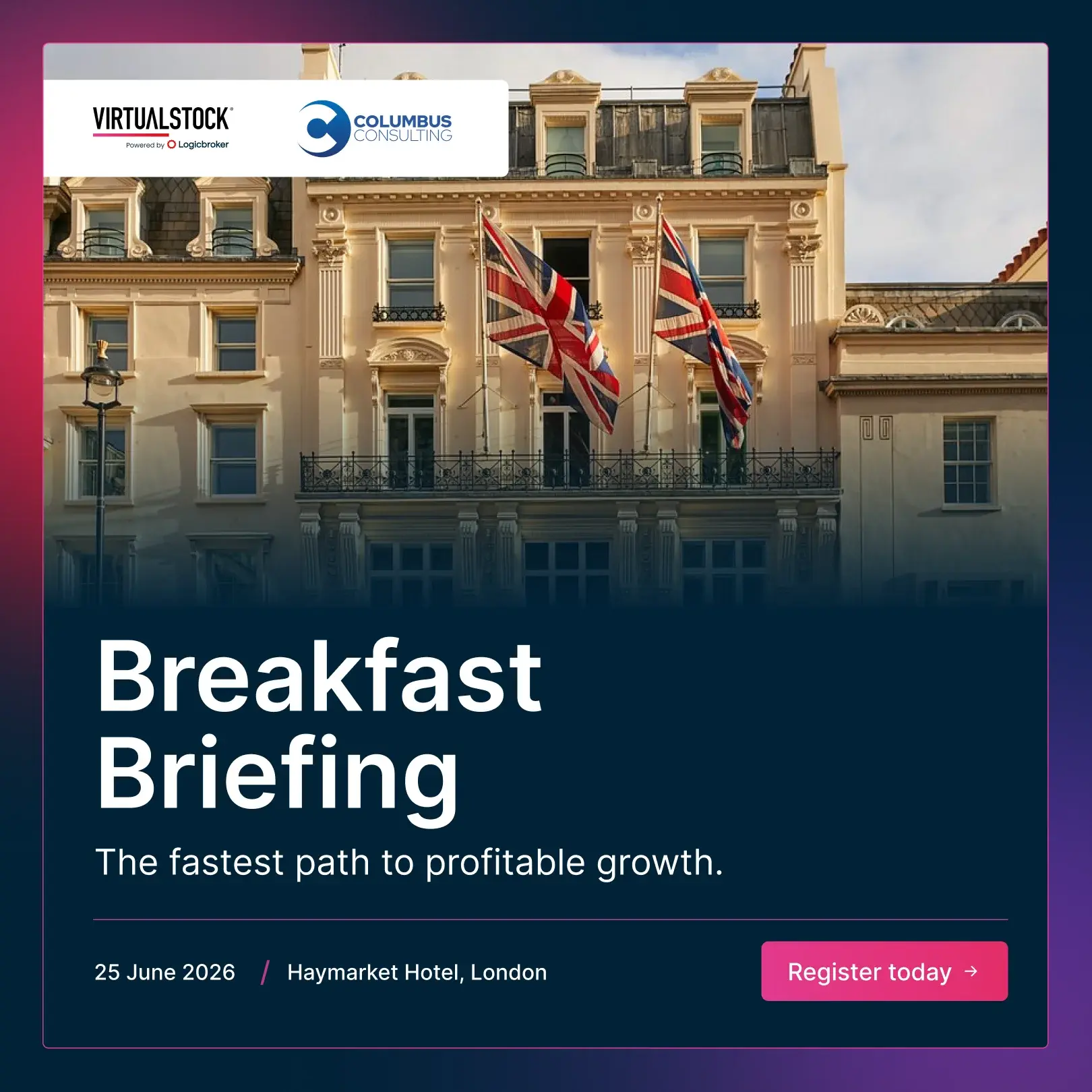
Gradient mesh — bareMidnight core, indigo through the middle, magenta at the right edge. The reference for Variant A.E-news headerSame mesh carrying the white lockup, fading to white at the base so body copy can sit beneath it.Social cardMidnight background with dual-branded logosEvent graphicMesh used as a full-bleed frame around a Midnight card, with darkened photography and a co-branded partner lockup.
Working from Real Product Screenshots
Rules for using real UI
Abstracted glass-card compositions are the default. Raw screenshots are the exception — use them only when exact UI accuracy matters.
Never include real customer names, partner names, logos, or identifiable order data in demo screenshots.
Crop to the meaningful region. Never show the full browser chrome, OS window, or desktop.
Never show unreleased features, internal admin tools, or screens not yet available to customers.
Replace any real data visible in the UI with clearly fictional placeholder values before publishing.
What We Show / What We Don't
What we show
Abstracted glass-card compositions that illustrate product concepts
Real product UI when accuracy matters — cropped, cleaned, and placeholder data only
Network, flow, and routing diagrams with dashed connectors
Light, airy, spacious layouts with ample white space
Layered card compositions that create depth without heavy shadows
What we don't
Stock photography of people — business handshakes, team at whiteboards, warehouse workers with clipboards
Muddy mid-tones — commit to Midnight or to white, never a grey in between
Drop shadows used to fake depth instead of layering
Third-party logos used as decorative elements
Generic "enterprise software" imagery with no connection to Virtualstock's product
08 — Icons
Icons
Describe a concept and get brand-ready icons instantly. Search across 1,900+ Lucide icons — download any result as SVG or PNG in your chosen brand colour.
The genuine brand files, straight from the Marketing asset library. SVG for print, signage, and anywhere you need to scale cleanly; PNG for web and presentations.